Announcement

Collapse
No announcement yet.

Help me decide here..... which one

Collapse
X
 
  • Filter
  • Time
  • Show
Clear All
new posts

    Help me decide here..... which one

    Ok I'm setting up a secondary company due to some new insurance and tax laws here, so which do you guys like better.

    They're just quick drafts, so the edges of the art work are really rough, but you get the idea.
    Attached Files
    Being a major OU fan and a staunch conservative.... I am perpetually vexed w/ the conundrum of who to hate more. Obama or the Univ. of Saxet.

    #2
    I like the 2nd the best!

    Best wishes!
    Mikes Liquid Audio: Knowledge Experience Customer Service you can trust-KICKER WetSounds ACME props FlyHigh Custom Ballast Clarion LiquidLumens LEDs Roswell Wave Deflector And More

    Comment


      #3
      I like the logo of the 1st one. The second one looks more high end. My

      Comment


        #4
        the second one will get more response if it's going on a vehicle.plus i just like it better.
        I do all my own stunt work. hey ya'll watch dis.

        Comment


          #5
          second one.

          Comment


            #6
            I vote for #1...

            Comment


              #7
              Robert this won't go on my truck.


              There's a chance I may just use both and keep

              1 For my Commercial jobs

              2 For my residential stuff
              Being a major OU fan and a staunch conservative.... I am perpetually vexed w/ the conundrum of who to hate more. Obama or the Univ. of Saxet.

              Comment


                #8
                First one looks too much like the Ronix logo, I like it but it's too similar. I vote for #2.
                2009 RZ2, PCM 343, MLA Surf Ballast, Premium Sound.
                2013 Toyota Sequoia 4WD W/Timbren SES

                Comment


                  #9
                  Originally posted by Ewok View Post
                  First one looks too much like the Ronix logo, I like it but it's too similar. I vote for #2.
                  I had to go look at it after seeing that statement b/c I have no clue what their logo looked like, and I had pulled that design out of thin air. I'm not seeing it, not one bit.... but thank you for the input!
                  Being a major OU fan and a staunch conservative.... I am perpetually vexed w/ the conundrum of who to hate more. Obama or the Univ. of Saxet.

                  Comment


                    #10
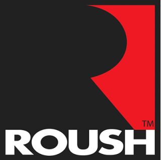
                    Also similar to Roush racing logo, that said I still like #1 better.

                    Comment


                      #11
                      Regency Films logo:


                      Roush logo:


                      But I still prefer #1

                      Comment


                        #12
                        #2

                        Comment


                          #13
                          #1 My math teacher always told me: keep it simple, stupid.

                          Comment


                            #14
                            #1 gets my vote. You always want something that you can use 1 piece of it as an identifier. When #1 is small, you can easily identify your company logo out of it, if you go with #2, you would have a hard time telling what the heck that is. Look to successful businesses out there such as Dell, IBM, Target, even Tige with it's orange waves. All of them have an identifiable piece that when shrunk down, you instantly know what it is.

                            Comment


                              #15
                              Here's an example. These logos are both 100px wide, which is easier to identify your company?
                              Attached Files

                              Comment

                              Working...
                              X