Announcement

Collapse
No announcement yet.

New Graphics direction

Collapse
X
 
  • Filter
  • Time
  • Show
Clear All
new posts

    New Graphics direction

    Okay, after talking it over with my lady. She wanted to go a bit of a different direction on the graphics. She wasn't to stoked with all the colors in the last concept. She wanted to go with gray and white, on the black part of the boat. So I went with a similar concept, but dramatically different. She is content with it (after she made, and by made I mean guilt tripped me into putting her name on it). So it's off to the printer to get some custom graphics made. Let me know what you all think about it.

    If you missed my last post I bought a 23v, but had to use the 24 for a reference shot. The color scheme is the same though.


    #2
    go for it

    Comment


      #3
      I like these graphics better than the last. Simple but modern.

      Comment


        #4
        Nice, now all you need is a pirate flag.
        Cursed by a fortune cookie: "Your principles mean more to you than any money or success."

        Comment


          #5
          I love how you put your names into the transom graphic. I'm not a fan of the skulls, but that 's just me.
          Mike Allen, Tigé owner since 1997

          Comment


            #6
            IMO better than the graphics that Tige puts on. I haven't like the graphic choices since 2006.

            Comment


              #7
              Originally posted by TeamAllen View Post
              I love how you put your names into the transom graphic. I'm not a fan of the skulls, but that 's just me.
              x2. Not a skull fan either, but it's pretty cool.

              Comment


                #8
                Looks sweet on black... cant wait to see what the finished product is gonna look like!

                Comment


                  #9
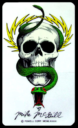
                  reminds me of a powell and peralta skatebaord graphic

                  Comment


                    #10
                    Kinda cool, roll with it
                    Mikes Liquid Audio: Knowledge Experience Customer Service you can trust-KICKER WetSounds ACME props FlyHigh Custom Ballast Clarion LiquidLumens LEDs Roswell Wave Deflector And More

                    Comment


                      #11
                      Originally posted by yllw20 View Post
                      reminds me of a powell and peralta skatebaord graphic
                      Totally!! An early Mike McGill maybe???


                      Or maybe the ripper....

                      Comment


                        #12
                        That would make a much better tattoo on your back, than Tige's OEM graphics.

                        Comment


                          #13
                          Originally posted by FacePlant View Post
                          Totally!! An early Mike McGill maybe???


                          Or maybe the ripper....

                          I love those old Powell graphics. Personally, I ride an old school Cabalerro.

                          I'm not a huge fan of the skulls either but, those look pretty cool. Definitely better than stock. My only criticism would be the Tige 23v on the sides. You should come up with something cooler than the stock logo.
                          You'll get your chance, smart guy.

                          Comment


                            #14
                            I wouldn’t do it myself because I would be too chicken, but I think it is very cool for you if that is what you like.

                            Not to the extreme of a tattoo but I would make sure the relationship is very solid before adding the significant others name to the boat or just make that area is interchangeable so you do not have to redo the whole transom graphic is things go south w/ the relationship.

                            I put a girlfriends name on the back of my 89 barefoot Nautique and that was only w/ vinyl letters, big mistake for me.

                            Comment


                              #15
                              thanks

                              Thanks guys for the great comments. I knew that some of you would be turned off by the skulls. To each his own right?

                              Gstuffer - With the girlfriends name on the graphics, we are actually getting married next sept. Plus it's her boat too, hence she wanted her name on it as well.

                              nicky - As a graphic designer, I'm actually really drawn to the tige logo. I don't really want to change the way it looks because I think they deserve to have their brand/logo on the side of the boat the way it was meant to be seen. JMHO
                              Last edited by bobbysky; 12-12-2008, 05:22 PM.

                              Comment

                              Working...
                              X