Announcement

Collapse
No announcement yet.

New and Improved - Choose your favorite!

Collapse
X
 
  • Filter
  • Time
  • Show
Clear All
new posts

    New and Improved - Choose your favorite!

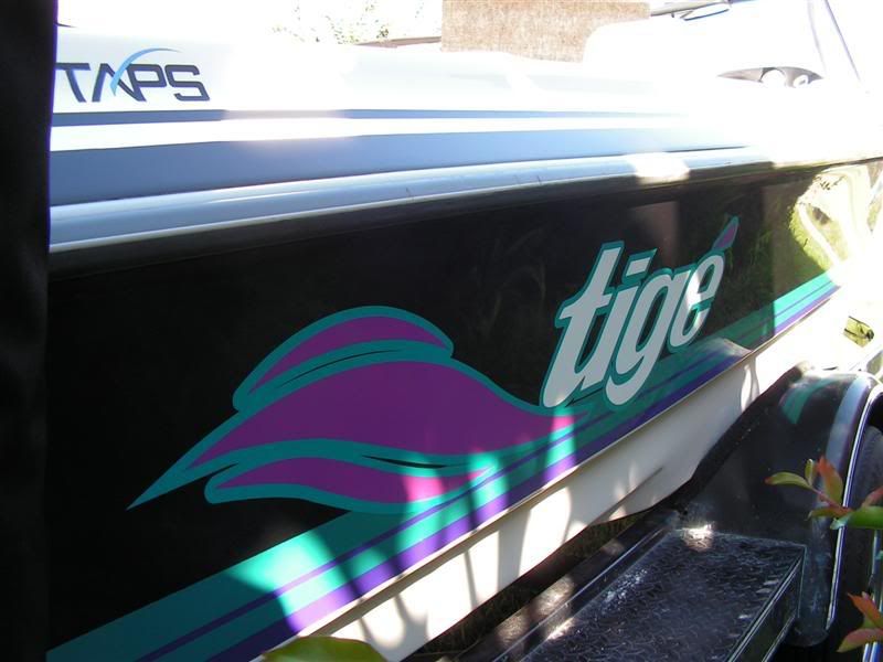
    I am deciding what graphics if any I should put on my boat. Please take a moment and vote for your favorite:

    Option #1:


    Option #2:


    Option #3


    Option #4


    Option #5 Leave as is:
    28
    Option 1
    46.43%
    13
    Option 2
    7.14%
    2
    Option 3
    0.00%
    0
    Option 4
    3.57%
    1
    Option 5
    42.86%
    12

    The poll is expired.


    #2
    Nice X's mang!
    http://www.wakeboatworld.com
    []) [] []V[] [])

    Comment


      #3
      So i guess option #5 it is huh!
      "Call me anything you want ... Just don't call me NOBODY!

      Comment


        #4
        Different options
        Attached Files

        Comment


          #5
          New and Improved - Choose your favorite!

          We are trying to decide what graphics if any we should put on our boat. Please take a moment and vote for your favorite:

          Option 1:


          Option 2:


          Option 3:


          Option 4:


          Option 5:

          Comment


            #6
            I like the graphics in option 1 and 2 but there needs to be something to fill that blank area on the back 1/4 of the boat like the flames in 2. (but i'm not a flame kinda guy)
            Mikes Liquid Audio: Knowledge Experience Customer Service you can trust-KICKER WetSounds ACME props FlyHigh Custom Ballast Clarion LiquidLumens LEDs Roswell Wave Deflector And More

            Comment


              #7
              First thing I would do, is pull your Registration Numbers and move them above the rub rail. I'd probably run it without graphics at all then. Maybe a small Tige on the aft.
              "I want to know God's thoughts, the rest are just details"

              Comment


                #8
                Sell it and get a new one instead.

                The stickers won't help the resale that much.

                I would pick none of the above. I would get the modernized Tige logo and then extend the lower stripe all of the way back. It looks funny just to stop the stripe 3 feet short of the transom.
                Be excellent to one another.

                Comment


                  #9
                  I think the stripe is in the gelcoat, at least on my previous 23V it was.

                  Comment


                    #10
                    i like it clean with nothing on it at all
                    Originally posted by G-MONEY
                    It hurts me to say it but go OU but only for this weekend!!!!

                    Comment


                      #11
                      Option 1 IMHO.

                      Comment


                        #12
                        I think an updated version of the tige logo, similar to the old would look best.

                        Originally posted by Tequilasun View Post
                        First thing I would do, is pull your Registration Numbers and move them above the rub rail. I'd probably run it without graphics at all then. Maybe a small Tige on the aft.
                        The angle on that part of the boat makes it somewhat difficult to get the 2" reg number there.

                        I went through this decision already as well....in the end I stuck with a classic look vs. some of the newer tribal looking stuff
                        Last edited by spharis; 12-07-2006, 05:08 PM.
                        http://www.wakeboatworld.com
                        []) [] []V[] [])

                        Comment


                          #13
                          Originally posted by talltigeguy View Post
                          Sell it and get a new one instead.
                          I can't now, I am too emotionally and financially committed with the towers, speakers, new bimini, wakeboard racks, and a new Tige key chain from the Tige Owner event!

                          However, eventually an RZ4 may persuade me......

                          Comment


                            #14
                            I like the look of the new limited graphic on the side by itself

                            Comment


                              #15
                              I'm a Tribal Graphics guy, but since that ain't your thing, I'm in for Option #5: it looks Clean, Classic, even w/your nice tower upgrade - good looking boat. The other options are mixing different looks and don't work for me.

                              Going completely bare might look good, too - a friend of mine bought an MC Prostar 209 w/no graphics two years ago - it looks tight as-is. I'll see if I can find a picture at home (of course you can just wipe yours clean w/your photo editor).

                              Have you considered the 'Limited' Graphic that Tige had out in '04 & '05? That may fit your style, and could look sweet if you're able to remove that lower white on blue line. May be some of those graphics sitting on a shelf somewhere...

                              Comment

                              Working...
                              X